
Nya nyanser och färgpar från färgcirkeln
Dessa instruktioner är avsedda för dig som är intresserad av att blanda dina egna unika nyanser.
Läs här bredvid hur du blandar dina egna nyanser från färg och hur du kan använda färgcirkeln som hjälp. Se några användbara videor om ämnet i slutet av instruktionerna.
Om att använda färgcirkeln
Färgcirkelns skiva har 12 segment – delar, där varje representerar en färg.
Skivan visar hur färger relaterar till varandra, vare sig de är intill varandra eller diametralt motsatta.

Den dubbelsidiga färgcirkeln innehåller tre primära färger, rött, gult och blått, samt tre sekundära färger, grönt, orange och violett (när två primära färger blandas bildar de en sekundär färg).
Färgcirkel innehåller dessutom sex tertiära färger, som är blandningar av primära och sekundära färger. Dessa är röd-orange, gul-orange, gul-grön, blå-grön, blå-violett och röd-violett.
Varma färger - röda, gula och rosa - finns på ena sidan. Kallare nyanser - blå, gröna och violetta - finns på motsatt sida av cirkeln.
Välj en färg, till exempel grönt – vrid sedan på färgcirkelns innerhjul så ser du hur det ser ut när du tillsätter rött till det valda gröna. Vrid mer och du ser hur grönt ser ut när du tillsätter gult osv.
Färgcirkel är dubbelsidig
Vrid färgcirkeln och studera den gröna färgen.
Placera cirkelns innersta skiva riktad mot grönt, och du ser i innercirkeln tre nyanser av grönt:
Med märkning Shade, Tone och Tint.
Shade: vald färg + vit
Tone: vald färg + grå
Shade: vald färg + svart

Våra Frenchic-kunder har skickligt blandat sina egna unika nyanser, som du hittar i FB-gruppen med sökordet FÄRGRECEPT. Gå med i gruppen här!
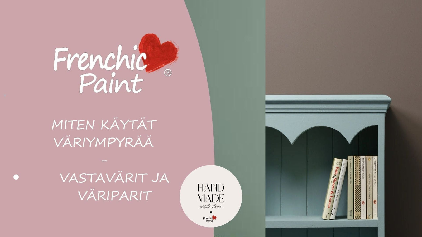
Hur skapar man fungerande färgkombinationer för hemmet med hjälp av färgcirkeln?
Att använda färgcirkeln för att bygga upp en färgpalett kräver också förståelse för olika typer av färgpaletter ur ett inredningsperspektiv. Granska nyanser med hjälp av färgcirkeln, tillsammans med färgteorin, utan att glömma dina egna preferenser.
Färgcirkel är bara ditt hjälpmedel, lita ändå på din egen åsikt och använd de nyanser du själv tycker om.
Färgcirkel kan dock vara till stor praktisk nytta, oavsett om du planerar stora helheter eller funderar på att skapa en vacker färgblandning.
Att blanda färger är roligt och genom att blanda nyanser själv kan du hitta helt unika och personliga färger att använda!
En flitig nyansblandare och målare har alltid vit och svart färg i hyllan, eftersom du med dem kan blanda otaliga nyanskombinationer som ändå passar vackert ihop – ett bra tips för renoverings- och inredningsmålare!
Enfärgade färgpaletter
Enfärgade färgpaletter skapar en harmonisk, lugn atmosfär som just nu är mycket trendig inom inredningsmålning. Det är trendigt just nu att måla tak och lister i samma eller nästan samma nyans som väggarna.
Du kan välja en huvudfärg, till exempel blå, och använda olika nyanser av blått på ytor och i inredningen, från mycket ljus till klar, grönblå och bläckblå beroende på rum och önskad stämning.
Kontrastfärger för modiga
I en kontrastfärgpalett används två färger från motsatta sidor av färghjulet.
Hur skulle till exempel orange och blått se ut tillsammans – denna teknik kan du också använda i liten skala – till exempel: måla en vägg blå och använd en orange lampa framför den blå väggen i inredningen.
Modiga kontrastfärger fungerar bra till exempel i retroinredning. Även modern inredning tål kontrastfärger som accent. Kontrastfärger är mycket behagliga för ögat.
Vilka färger passar bra ihop i inredningen?
Om du följer färghjulet hittar du ett brett utbud av nyansalternativ att välja mellan.
Vissa av dessa kombinationer är redan bekanta för dig, medan andra kanske är nya.
Här är några lyckade kombinationer som är värda att överväga:
Gult och grönt: Hot as Mustard och Constance Moss
Grönt och naturvitt: Green With Envy och Parchment
Gult och orange: Oopsy Daisy och McFee
Blått och rött: Hornblower och Rubina
Blått och grönt: Ol' Blue Eyes och Wise Old Sage
Blått och orange: Ol' Blue Eyes och Earthy
Blått och ljusrosa: Kiss Me Slowly och Dusky Blush
Grönt och ljusrosa: Steaming Green och Rosy Dusk
Lek med nyanser och nyansstyrkor
Ett bra tips är att använda olika mättnadsnivåer av färgen.
Vi rekommenderar att använda en ljusare nyans av en färg och en mörkare nyans av en annan.
Till exempel: Grönt och ljusrosa
Använd mörkare grönt och ljusrosa tillsammans – en garanterat fungerande kombination! Till denna kombination passar också hallonrött och fuchsia som krydda.
Avsluta rummet med en ljusblå golv. Märker du att en säker kombination är som hämtad direkt från naturen!
Grönt är trendigt i inredning just nu
Du kan naturligt kombinera grönt med alla naturliga nyanser: blått, brunt, terrakotta, beige och svart – samt deras olika variationer.
Tänk på himlen – havet och marken. Med dessa nyanser kan du skapa en trivsam och naturlig lugn bakgrund för resten av hemmets inredning.
I naturliga nyanser kan du vara modig – prova vattenfärger, djup skoggrön och frisk himmelsblå.
Kombinera med en mjuk gräddton istället för vitt om du vill ha mjuka nyanser.
Vad passar till grått?
Grått är fortfarande populärt i inredning, du kan välja par till grått från livfull terrakotta, blått och olika röda nyanser.
Även kryddiga nyanser av brunt och gult passar bra till grått.
Nu när du har lite mer information om hur du kan använda dubbelsidiga färghjulet och hur färger blandas, får du garanterat inspiration att skapa dina egna perfekta paletter!
Här kommer du smidigt direkt till nyanserna.
Din egen färghjul kan du skaffa här.
Här kan du läsa mer hur du blandar dina egna, unika nyanser.