Med hjälp av en dubbelsidig och stor färgcirkel (diam. ca 24 cm) kan du hitta perfekta färgpar och nya unika färgblandningar för ditt hems färgpalett eller till exempel för att designa färgkombinationer för kläder och konst.
En färgcirkel är ett enkelt verktyg som visar hur färger beter sig när du tillsätter svart, vitt eller en helt annan nyans. Genom att vrida på skivans delar ser du olika kombinationer av nyanser.
Med andra ord kan du snabbt se vilka färger som passar ihop och vilka som är komplementfärger eller nyanspar.
Den dubbelsidiga färgcirkeln, med en diameter på ca 24 cm, är mångsidig och lättanvänd.
Texten på färgcirkeln är på engelska.
Läs mer under fliken.
Färgskivan har 12 segment – delar som var och en representerar en färg. Skivan visar hur färger relaterar till varandra, vare sig de är intill varandra eller diametralt motsatta.
Den dubbelsidiga färgcirkeln innehåller tre primära färger: rött, gult och blått, samt tre sekundära färger: grönt, orange och violett (när två primära färger blandas bildar de en sekundär färg).
Färgcirkelns sex tertiära färger är blandningar av primära och sekundära färger. Dessa är röd-orange, gul-orange, gul-grön, blå-grön, blå-violett och röd-violett.
Varma färger – röda, gula och rosa – finns på ena sidan. Kallare nyanser – blå, gröna och violetta – finns på motsatt sida av cirkeln.
Välj en färg, till exempel grönt – vrid sedan på färgcirkelns innerhjul för att se hur det ser ut när du tillsätter rött till det gröna. Vrid mer och se hur det gröna ser ut när du tillsätter gult osv.
Vrid på färgcirkeln och studera den gröna färgen. Placera innerhjulet riktat mot grönt, och du ser tre nyanser av grönt i innerhjulets vy: Shade, Tone och Tint – markerade.
Shade: vald färg + vitt
Tone: vald färg + grått
Tint: vald färg + svart
Våra Frenchic-kunder har skickligt blandat sina egna unika nyanser, som du hittar i Facebookgruppen med sökordet FÄRGRECEPT. Gå med i gruppen här!
Hur skapar man fungerande färgkombinationer för heminredning med hjälp av färgcirkeln?
Att använda färgcirkeln för att bygga en färgpalett kräver också förståelse för olika typer av färgpaletter ur ett inredningsperspektiv. Studera nyanser med hjälp av färgcirkeln tillsammans med färgteori, utan att glömma dina egna preferenser.
Färgcirkel är bara ett hjälpmedel, lita ändå på din egen smak och använd de nyanser du gillar. Färgcirkel kan dock vara mycket praktiskt, oavsett om du planerar stora helheter eller funderar på att göra en vacker nyansblandning.
Att blanda färger är roligt och genom att blanda nyanser själv kan du hitta helt unika och personliga färger att använda!
En flitig nyansblandare och målare har alltid vitt och svart färg i hyllan, eftersom du med dem kan blanda otaliga nyanskombinationer som ändå passar vackert ihop – ett bra tips för renoverings- och inredningsmålare!
Enfärgade färgpaletter
Enfärgade färgpaletter skapar en harmonisk, lugn atmosfär, vilket just nu är supertrendigt inom inredningsmålning. Det är trendigt att måla tak och lister i samma eller nästan samma nyans som väggarna.
Du kan välja en huvudfärg, till exempel blå, och använda olika grader av blått på ytor och i inredningen, från mycket ljus till klar, grönblå och mörkblå beroende på rum och önskad stämning.
Komplementfärger för modiga
I kontrastfärgpaletter används två färger från motsatta sidor av färgcirkeln. Hur skulle till exempel orange och blått se ut tillsammans? Denna teknik kan också användas i liten skala – till exempel: måla en vägg blå och använd en orange lampa i inredningen framför den blå väggen. Komplementfärger är också behagliga för ögat.
Vilka färger passar bra ihop i inredning?
Om du följer färgcirkeln hittar du ett brett utbud av nyansalternativ att välja mellan. Vissa av dessa kombinationer är redan bekanta för dig, medan andra kanske är nya.
Här är några lyckade kombinationer att överväga:
Lek med nyanser och nyansstyrka
Ett bra tips är att använda olika mättnadsnivåer av en färg. Vi rekommenderar att använda en ljusare nyans av en färg och en mörkare nyans av en annan. Till exempel: grön och rosa.
Använd mörkare grönt och ljus rosa tillsammans – en garanterat fungerande kombination! Till denna kombination passar också hallonrött och fuchsia som krydda. Avsluta rummet med en ljusblå golvton. Märker du att denna säkra kombination känns som hämtad direkt från naturen!
Grönt är just nu hett inom inredning. Du kan naturligt kombinera grönt med alla naturfärger: blått, brunt, terrakotta, beige och svart – samt deras olika nyansvariationer.
Tänk på himmel – hav och jord. Med dessa nyanser kan du skapa en trivsam och naturlig lugn bakgrund för resten av hemmets inredning.
I naturfärger kan du vara modig – prova vattenfärger, djup skoggrön och frisk himmelsblå.
Kombinera grönt med mjuka krämiga nyanser istället för vitt om du vill ha mjukare toner.
Vad passar till grått?
Grått är fortfarande populärt i inredning, och du kan välja färgpartners till grått från livfull terrakotta, blått och olika röda nyanser. Även kryddiga toner från brunt och gult passar bra till grått.
Nu när du har lite mer information om hur du kan använda den dubbelsidiga färgcirkeln och hur färger blandas, får du säkert inspiration att skapa dina egna perfekta paletter!

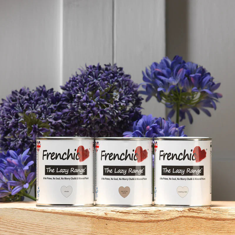
I denna omfattande guide presenterar vi de vanligaste alternativen för att göra det lättare för dig att välja rätt målarserie. Eftersom vi också har flera målarserier vill vi hjälpa dig att hitta rätt serie för ditt projekt.

Äntligen har du tillgång till tiotals vackra färdiga nyanser för golvmålning, som proffsen redan har designat för att passa vackert i många olika inredningar!

Vi har samlat de vanligaste ofta ställda frågorna (FAQ) och svaren om Frenchic-färger här. Vi uppdaterar sidan regelbundet, så det är värt att följa den.