
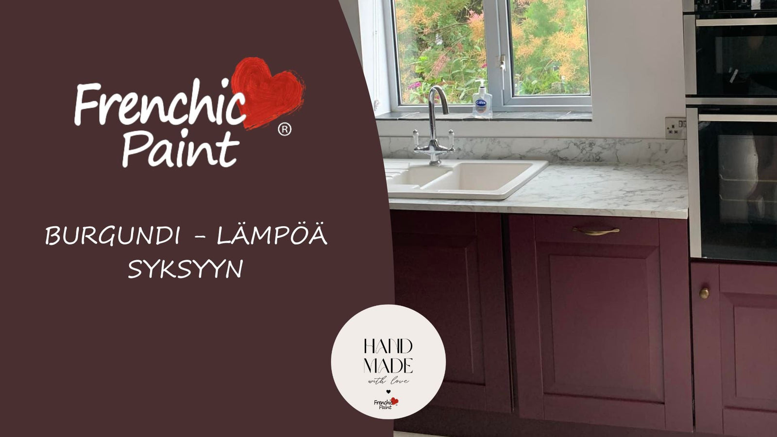

Värm upp ditt hem med höstens trendigaste nyans – förtrollande Burgundy - underbar vinröd

Hösten har kommit, och vad kan vara ett bättre sätt att ta in värme och elegans i hemmet än att välja säsongens trendigaste nyans: burgundy.
Men vad kan man kombinera den med och vad inte?
Läs i denna blogg tips om hur du använder inredningens hetaste nyans på rätt sätt.
Denna djupa, rika vinröda nyans är det perfekta valet för höstens inredning, eftersom den utstrålar komfort, förfining och en touch av lyx.
Väljer du björnbärs vinröda nyans, den mörka auberginen eller nästan bruna med en antydan av starkt rödvin?
Burgundy är en färg som ger hemmet efterlängtad värme under kyliga dagar och kvällar.
Burgundyns Historia
Burgundy är en nyans med en rik och mångfacetterad historia. Namnet "burgundy" härstammar från den franska regionen Bourgogne, som var känd för sin vinodling och betydande historiska prestationer.
Denna djupa röda nyans har varit särskilt populär bland Europas adel under medeltiden, då den symboliserade makt, rikedom och förfining.
Under renässansen var burgundy en lyxig färg som användes i konst och mode.
Många berömda konstnärer, som Botticelli och Michelangelo, använde burgundnyanser i sina målningar för att skapa djup och dramatiska kontraster.
Denna färg var också populär i kunglig klädsel, vilket stärkte dess ställning som en värdefull och uppskattad nyans.
Under 1700- och 1800-talen fortsatte burgundy att vara populär, särskilt inom inredning och arkitektur.
Den valdes ofta som färg för tapeter, möbler och textilier eftersom den tillförde värme och elegans till rummen. I början av 1900-talet spreds användningen av burgundynyanser även till konst och mode, där de behöll sin plats som klassiska och tidlösa färger.
Idag är burgundy fortfarande ett populärt val både inom inredning och modevärlden. Dess tidlösa charm och mångsidighet gör den till ett perfekt val för både traditionella och moderna inredningsstilar.
Burgundy är en färg som förenar det förflutna och nuet, och tillför hemmet en touch av historia och ständig elegans.
Burgundys magi – djup och värme till hemmet
Burgundy och vinröda nyanser erbjuder en perfekt balans för hösten: både djärv och inbjudande.

Denna eleganta och intensiva röda nyans tillför rummet djup och intensitet, samtidigt som den utstrålar en hemtrevlig värme.
Det är det perfekta valet för dig som vill ge ditt hem en lyxig och djup nyans utan att rummet känns för tungt eller mörkt.
Oavsett om din inredningsstil är modern, bohemisk eller klassisk fungerar burgundy utmärkt både som huvudfärg och accent.

Denna färg är perfekt för att tillföra sofistikering till vardagsrummet, sovrummet eller kanske matsalen, där dess djupa nyans skapar en inbjudande atmosfär.
En harmonisk kombination – Burgundy och neutrala färger
En av burgundys styrkor är dess förmåga att smälta sömlöst ihop med neutrala nyanser.
Mjuka neutrala färger som beige, krämvitt eller grått är perfekta följeslagare till burgundy. Denna kombination ger inredningen djup och säkerställer att helheten förblir balanserad och stilren.
Om du inte vill måla hela rummet i burgundy kan du använda det som subtila accenter tillsammans med mer neutrala nyanser.
Prova Boho Berry och Boujee-nyanser kombinerade med mjuka bakgrundsfärger som grått Shush, Swankypants, Spitfire eller ljusa Ballerina, Marschmellow, Parchment och Stone Rosie, för att skapa perfekt kontrast och en djup, varm atmosfär.
Skapa lager på lager med textilier och material
Burgundyn kommer verkligen till sin rätt när den kombineras med mjuka, texturrika material.

Prova att lägga till sammetskuddar, lyxiga ullplädar och fluffiga mattor som framhäver burgundyns djup och värme.
Så här skapar du lager på lager i rummet, vilket gör inredningen ännu mer tilltalande och trivsam.
När burgundyn kombineras med naturmaterial som trä eller metall, såsom silver, mässing eller koppar, blir resultatet en sofistikerad och tidlös look.
Värmen från mörkt trä framhäver burgundyns intensitet, medan ljusare träslag som ek ger rummet lätthet och fräschör.
Burgundy som accentfärg – en liten touch av elegans

Om du vill lägga till bara en liten touch av burgundy eller auberginefärger i rummet – dessa nyanser fungerar utmärkt även som accentfärger.
Du kan framhäva burgundynyanser genom att måla enstaka möbler, ramar eller kanske en accentvägg.
Små detaljer, som burgundyfärgade kuddar, gardiner eller ljus, tillför precis lagom med värme och djup till rummet utan att färgen dominerar för mycket.
Att föra in burgundynyanser i inredningen, till exempel i form av sammetskuddar, gardiner eller plädar, gör rummet lyxigt och bekvämt – ett perfekt sätt att ta in hösten i hemmet.
Inspireras av höstens stämning – kombinationer av burgundy och naturfärger
Naturliga nyanser och burgundy bildar tillsammans en perfekt harmoni.
Prova att kombinera burgundy med jordnära färger som terrakotta eller naturliga trätoner. Denna kombination ger hemmet värme och en jordande atmosfär, vilket gör rummet ännu mer inbjudande.
Burgundy och naturmaterial som ull och lin kompletterar varandra och skapar en balanserad och lugn miljö.
Mörkbrunt och burgundy framhäver varandras rika nyanser, och till exempel med Liquorice-nyanser kan du komplettera den höstliga stämningen.
Färdigt genomtänkta nyanser med Boho Berry och Boujee-nyanser är:
Rosy Dusky, Steaming Green, Olivia, Honeycombe, Earthy och Liquorice.
Färgkunskap – en kort introduktion: Hur man kombinerar burgundy stilfullt
Burgundy är en otroligt mångsidig färg, men rätt kombination kan ta inredningen till nästa nivå.
Färger som passar perfekt med burgundy:
1. Neutrala nyanser
- Beige och krämvitt
- Grått och greige
2. Jordnära färger:
- Terrakotta och lerfärger
- Brunt och mörka trätoner
3. Metalliska kombinationer:
- Guld och mässing
- Koppar
Färger som inte bör kombineras med burgundy:
1. För klara nyanser: till exempel neonfärger som neongrön eller neonorange.
2. Klar röd: kan skapa en konkurrerande effekt med burgundy.
3. För kalla nyanser: som klarblå.
Och naturligtvis – dessa instruktioner är bara riktlinjer, avsedda att anpassas, brytas och förbättras – precis efter dina egna färgpreferenser – så testa! Kombinera färger modigt och hitta de bästa nyanskombinationerna bland de förbjudna – gör personliga val, för dig själv.
Vill du lära dig mer om färger? Läs mer om grönt här.