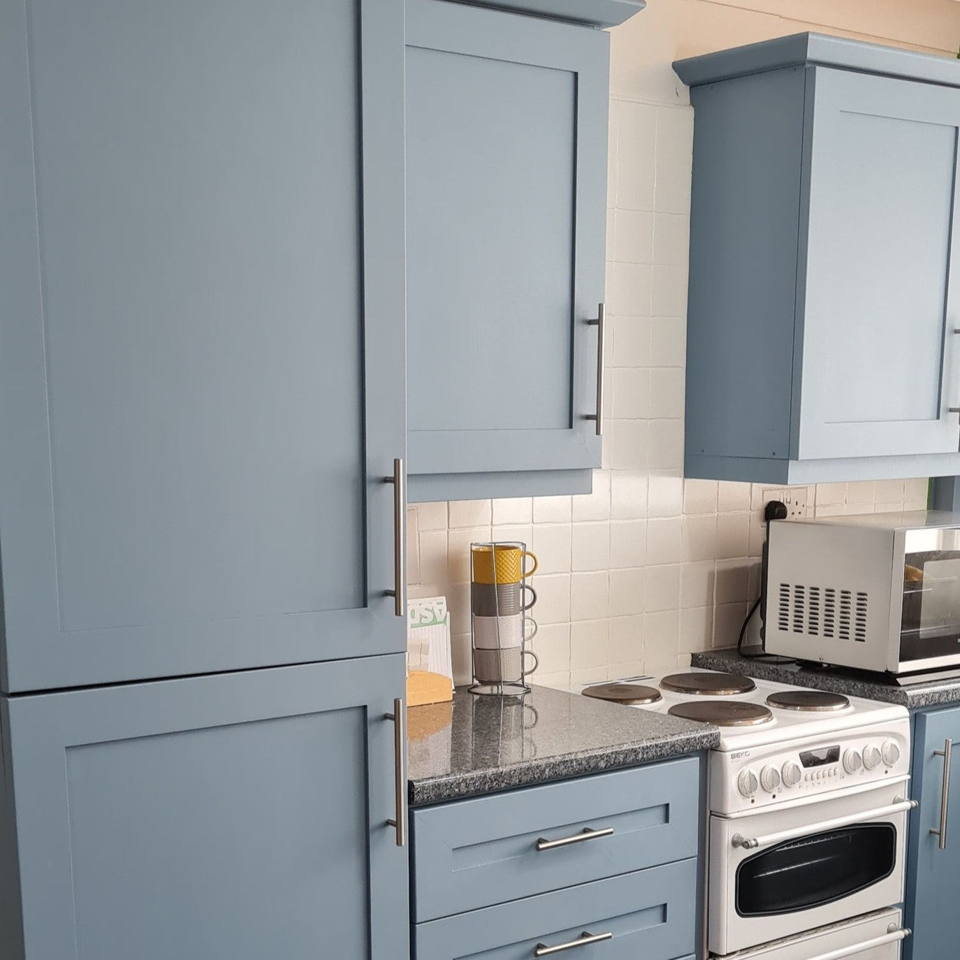


När du väljer väggfärg är det lätt att bli förälskad i en liten färgprovbit eller en fantastisk bild i en inredningstidning. Men sanningen är att samma nyans kan se helt annorlunda ut hemma. En av de största orsakerna till detta är belysningen. Både dagsljus och konstljus förändrar avsevärt hur våra ögon uppfattar färger.
I den här bloggen går vi igenom varför belysning är en så viktig del av färgvalet, hur olika ljuskällor påverkar väggfärgens nyans och vad man bör tänka på innan det slutgiltiga beslutet.

Dagsljus – dagsljuset förändrar färgen ständigt
Dagsljus är den starkaste enskilda faktorn som avgör hur färgen ser ut på väggen.
-
Morgonljus: särskilt i rum med norrläge är ljuset blåaktigt och kallt. Därför kan till exempel ljusgrått se blått ut.
-
Mitt på dagen: i rum med söderläge framträder färgerna varma och klarare. Beige kan se nästan krämvit ut och grönt ännu friskare.
-
Kvällsljus: när solen går ner får ljuset gyllene och orange toner. Då kan till exempel vita väggar skifta mot gula och rödaktiga nyanser.
👉 I praktiken betyder detta att samma färg på väggen kan se ut som en nyans på morgonen och helt annorlunda på kvällen.
Konstljus – lampans typ avgör
Förutom dagsljus är konstljus avgörande, särskilt på vintern och kvällstid. Ljuskällans färgtemperatur påverkar mycket:
-
Varmvitt ljus (2700K): skapar en hemtrevlig atmosfär men kan få kalla färger (t.ex. blått eller grått) att se grumliga eller gröna ut. Å andra sidan återges varma färger som terrakotta eller beige mjukt och vackert.
-
Kallvitt ljus (4000–6000K): framhäver kalla färger som vitt, grått och blått. Varma toner kan däremot bli för gula eller till och med obehagligt orange.
-
Neutralt ljus (3000–3500K): en bra kompromiss om du vill se färger så naturligt som möjligt. Detta passar särskilt när det finns många olika nyanser i rummet.
Färger och belysning – praktiska exempel
-
Vita nyanser: neutral vit blir lätt gulaktig i varmt ljus och blåaktig i kallt ljus. Det är därför viktigt att noga välja om man vill ha en varm eller kall atmosfär.
-
Grå nyanser: grått är ofta en svår färg eftersom den absorberar omgivningens färger. Norrsken framhäver blåaktiga toner, medan varmt kvällsljus får den att skifta mot brunt.
-
Blå nyanser: i kallt ljus framhävs klara och fräscha nyanser, men i varmt ljus kan blått se grönt ut.
-
Gröna nyanser: i dagsljus är grönt ofta fräscht och balanserat, men i konstljus kan det skifta mot gult eller blått beroende på lampans typ.
Rummets användningsområde och belysning
Det är också bra att anpassa belysningen efter rummets användningsområde.
-
Vardagsrum: varm belysning kombinerad med jordnära nyanser skapar en hemtrevlig atmosfär.
-
Arbetsrum: neutralt eller något kallt ljus kombinerat med klara, svala nyanser förbättrar koncentrationen.
-
Sovrum: mjukt ljus och dämpade nyanser lugnar och gör rummet rofyllt.
-
Badrum: starka ljus och ofta kalla nyanser kan göra rummet modernt och fräscht, men å andra sidan framhävs mörk färg dramatiskt.

Praktiska tips för att välja rätt nyans
-
Testa alltid med provbitar – måla ett A4-stort område eller använd en avtagbar provmålningsplatta. Den flyttbara och självhäftande Peel & Stick A5-stor nyansark är perfekt för att välja nyans.
-
Titta på färgen vid olika tidpunkter på dygnet – du märker snabbt hur ljuset förändrar nyansen.
-
Använd rätt lampor redan i testfasen – testa färgytan med den belysning du tänker använda.
-
Tänk på miljön runt ytorna – golv, möbler och textilier påverkar hur färgen ser ut när ljuset träffar dem. Till exempel kan en orange talltak eller -golv reflektera rödaktiga toner i ljusa och vita nyanser.
-
Undvik enbart färgkartan – en pappersutskrift visar aldrig exakt samma som färgen på en riktig yta eller färgkartor och färgprover tillverkade av riktig färg, som i Frenchic-serien. A5-stor Peel & Stick-färgprov underlättar färgvalet. Baksidan av arket har en praktisk klisteryta, så du kan enkelt flytta arket efter ljuset. Rekommendationen är att du tittar på minst två färgprover samtidigt.

Nyckelfaktorer för rummets atmosfär – sammetslen och stilren
Frenchics väggfärgers glansgrad är bara 5%, vilket ger en underbart sammetslen, diskret och stilren yta. Vår ultramatt väggfärg ger en exceptionellt lugn och tidlös atmosfär, oavsett om ditt rum är hemma eller på företaget.
Börja med att bestämma vilken stämning du vill skapa i rummet. Välj sedan minst tre, helst fem nyanser som ger den önskade stämningen. Testa dessa nyanser just i det rum och på den yta där du tänkt använda dem.
Välj nyanser modigt efter din egen smak: till exempel ger en mild och ljus rosa väggfärg en fantastisk och mjuk ton till hela rummet – som en vacker morgonsol i hela rummet!
Medelhavets terrakotta passar bra i svenska hem. Den vackra rödlera-nyansen är som vackrast i kvällssolen.
Frenchics vita nyanser är inte tonade med svart, så de saknar den lite smutsiga "målarvitt"-tonen. Den rena vita Whitey White väggfärg passar utmärkt för målning av till exempel gulnade och mörknade träpaneltak.
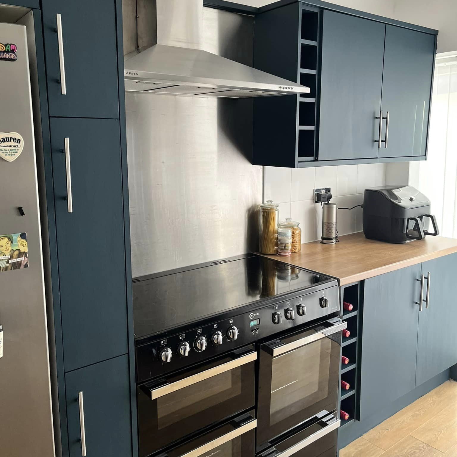
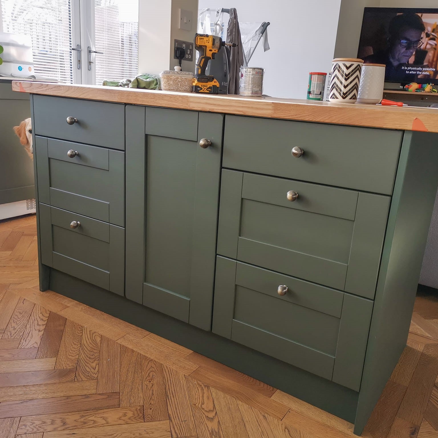
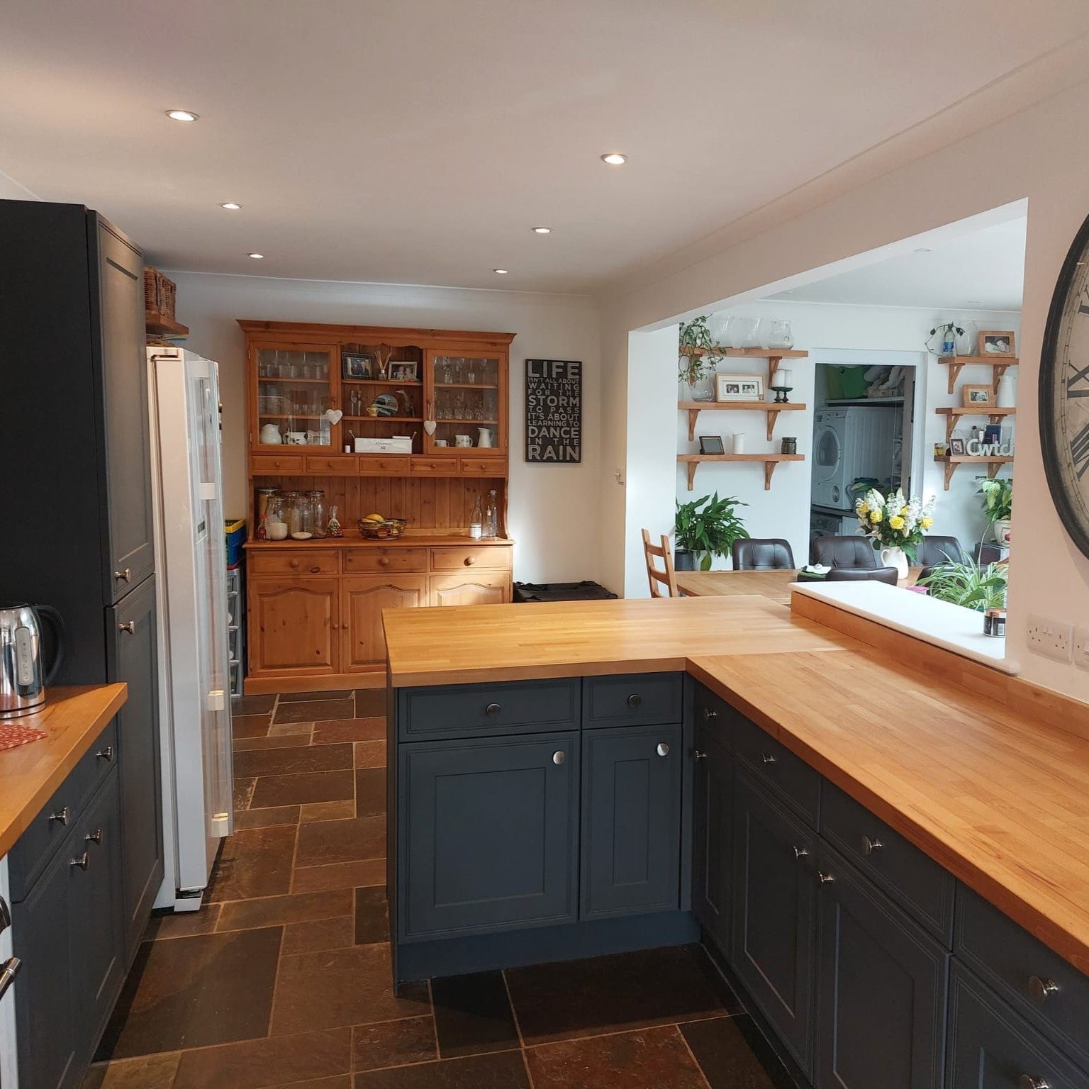
Belysning kan göra vitt gult, grått blått och blått grönt. Därför räcker det inte att bara titta på färgkartan, färgen måste alltid testas i en verklig miljö och under rätt belysning. När du tar hänsyn till riktningen på dagsljuset, tid på dygnet och hemmets lampor, får du ett slutresultat som bättre motsvarar förväntningarna och tjänar rummets atmosfär.
Till slut går belysning och färg hand i hand. Tillsammans skapar de ett rum där du trivs bäst. Om du vill läsa mer om färger i inredning och hur du skapar stämning, kan du börja här.
Utforska Frenchic Paints väggfärger och hitta den nyans som passar dina behov från det breda sortimentet!

Apple Barn, väggfärg