

LÄR KÄNNA FÄRGEN BLÅ
Vill du lära känna färgerna?
FÄRGTERAPI I INTERIÖR - funderingar kring färgval
Vi ville skriva en liten serie med några färger för dig, för din nöje och nytta.
Denna långa text är inte tänkt att läsas som ett objektivt faktum, utan att visa ett exempel på hur färger kan användas på en mängd olika sätt och hur färger kan tänkas på olika sätt. I den första skriften är ämnet en finländare kär färg; blå.
I århundraden har färger använts i kläder,
i målningar, flaggor, smink, symboler och dekorationer för att manipulera andras medvetna tänkande.
Färg är den största faktorn som påverkar hur du vill att andra eller dig själv ska känna – använd informationen när du vill ändra stämningen.
Färger är en viktig faktor i vår vardagliga miljö; inom konst, design, reklam, fester, påklädning, inredning av våra hem.
Bara med färg skapar du atmosfären!

Visste du det här om färgen blå?
Till exempel kan Wikipedia berätta att färger gjordes på medeltiden av jord, kol och animaliskt fett. Till exempel var den sällsynta Ultramarine-blå som bröts i Afghanistan en dyr och eftertraktad färg som ibland fick vänta i flera år. Det behövdes till exempel i målningar av Jungfru Maria. Ultramarin är alltså namnet för en nyans av blått, men det betyder också "bortom haven" - beskrivande för havsfärden av jordpigment och andra importerade varor till städerna.
Lugnt och fridfullt:
Blått förknippas ofta med en känsla av lugn och ro. Det är ett populärt val för att skapa avkopplande och mysig interiör. Blått är ofta tänkt som en cool färg. Lydnad, lugn, lugn.
Mångsidighet:
Blå finns i ett brett utbud från mjuka och dämpade pastellfärger till livfulla och djupa marinblå. Denna mångsidighet gör den perfekt för en mängd olika designstilar och teman.
Blått anses vara en tidlös och hållbar färg inom inredning. Den kan användas som en dominerande huvudfärg eller som en accent, så den är lämplig för många applikationer och stilar.
Kyleffekt: Ljusare blå nyanser kan skapa en kylande effekt i rum.
Bildspråk: Bildspråk och språkbilder av färger - liknelser - kommer ofta från naturen: vatten, himmel, hav eller från växter som en husdjursblomma. Kungsblå - värdigt och elegant.
Balans: Blå kan fungera som ett balanserande element i interiören, kompletterar varmare färger och ger en känsla av stabilitet.

Blått i hemrenovering
Väggfärger: Blå är ett populärt val för väggfärger i sovrum och badrum, där dess lugnande egenskaper främjar en känsla av avkoppling.

Möbler och dekoration: Blå möbler och inredningsföremål som soffor, stolar, mattor och gardiner sätter färg på vardagsrum och skapar en mysig och inbjudande atmosfär.
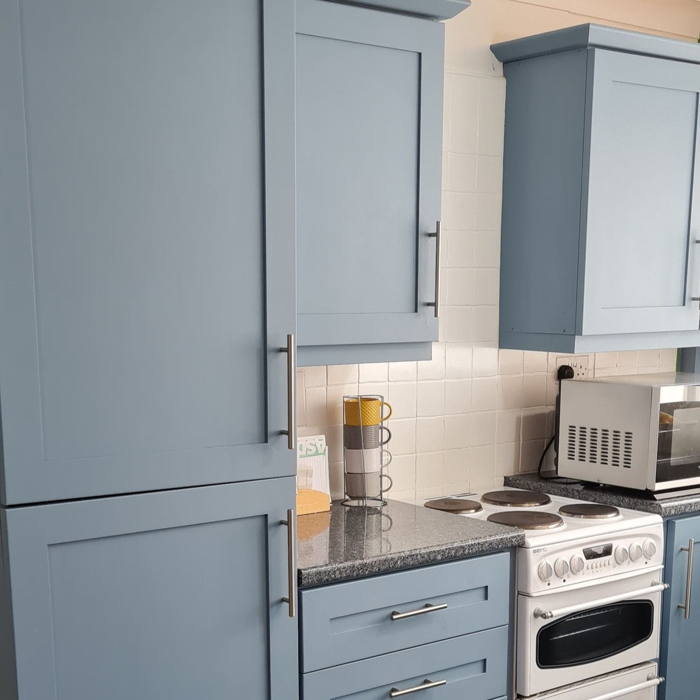
Köks- och badrumsytor: Blått kakel, speciellt i nyanser av aqua eller turkos, används ofta i kök och badrum för att framkalla en lyxig och fräsch spa-atmosfär inspirerad av närheten till havet eller vattnet. Du kan lägga till blått till ett annars ljust badrum genom att måla dörren eller taket i rummet blått.
Blått i inredningen
Nautiska teman: Strand-hav och nautiska teman inkluderar ofta nyanser av blått, som marinblått, himmelsblått och ljust mellanblått. Du kan använda turkos igen för att skapa en strandliknande, avslappnad atmosfär - inne eller ute i trädgården eller på terrassen.

Beach Hut, ljus turkos väggfärg och möbelfärg.
Grekland och Italien i köket: Med knallblått och turkos kan du enkelt få en medelhavsatmosfär till köket eller trädgården.

Kiss Me Sloely är en underbar elektrisk blå.
Den blå och vita färgkombon är ett tidlöst klassiskt val för textilier, porslin och annan inredning i finska hem, sommarstugor, sjöstränder och skärgårdar.
Djärva accenter: I modern design används djärva och levande blåtoner som accentfärger för att skapa en slående kontrast med neutrala bakgrunder eller kontrasterande färger.
Elblå Kiss Me Sloely är nu DEN blåa du ser inom mode och konst.
I år är knallblått och olika nyanser av bensin trendigt i både kläder och dekoration. De blågröna och rökiga blå nyanserna av vatten är nu extremt populära i väggfärger.
Vad sägs om en djärv färgyta på väggen - Color Block!? Lägg till färg genom att måla en fantastisk rand, pepparkakskant, båge, cirkel eller fyrkant direkt på väggen! Du kan enkelt implementera en i till exempel en hall eller ett barnrum.

Vad passar med blått?
Guld passar bra till den mörka och eleganta denimblå, och orange och terrakottatoner används som effekt. Beige och vitt är också säkra val tillsammans med blått.
Distressed himmelsblå är en perfekt, mysig köksnyans och en favorit för sommarstugor och strandbastur – den kombineras vackert med benvita och krämfärgade nyanser, salviagrönt och puderrosa.
En klassisk kombination är lämplig för en inredning med havstema: röd-vit-blå - eller är den blå-röd-vit? Ljusgul är en bra accentfärg för temat marinblått.
Eftersom blått är en av naturens dominerande färger, kan du kombinera det med nästan vad som helst – ta en aning från naturen!
Psykologiska aspekter av färgen blå
Lugn och avslappning: Blått är känt för att främja känslor av lugn, avslappning och lugn. Det kan hjälpa till att minska stress och ångest.
Förtroende och stabilitet: Blått förknippas ofta med tillförlitlighet och stabilitet. Detta gör det till ett populärt val för affärsmiljöer och professionella utrymmen.
Coolness: Mörkare nyanser av blått kan förmedla coolhet och sofistikering, en elegant känsla, vilket gör dem lämpliga för formella utrymmen.
Blå är ett mångsidigt och hållbart färgval som du kan använda för att skapa en lugnande och fridfull atmosfär i din inredning.
Blues breda utbud av nyanser och anpassningsförmåga till olika designstilar gör det till ett populärt val för både traditionella och moderna miljöer.
Oavsett om blått används som en dominerande färg eller som accent, framkallar du med blått en känsla av lugn och tidlös elegans i den moderna hem- och sommarvillan. Oavsett om du letar efter en klassisk heraldisk blå eller en trasig azurblå, hittar du dem alla i vårt färgutbud.
Om du vill se vad andra har målat med blå toner, ta en titt på vår Facebook-grupp: ' Frenchic Paint Finland '

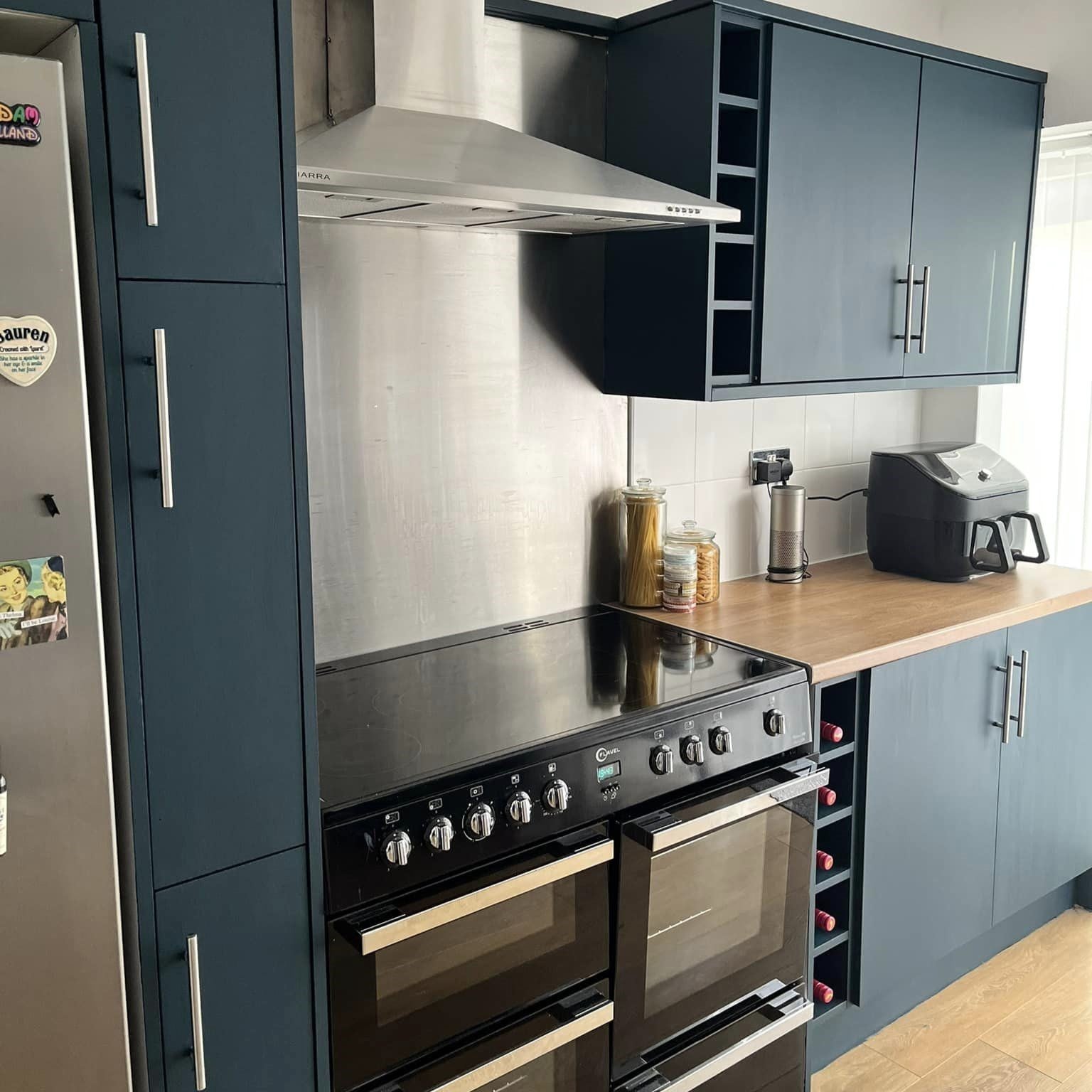
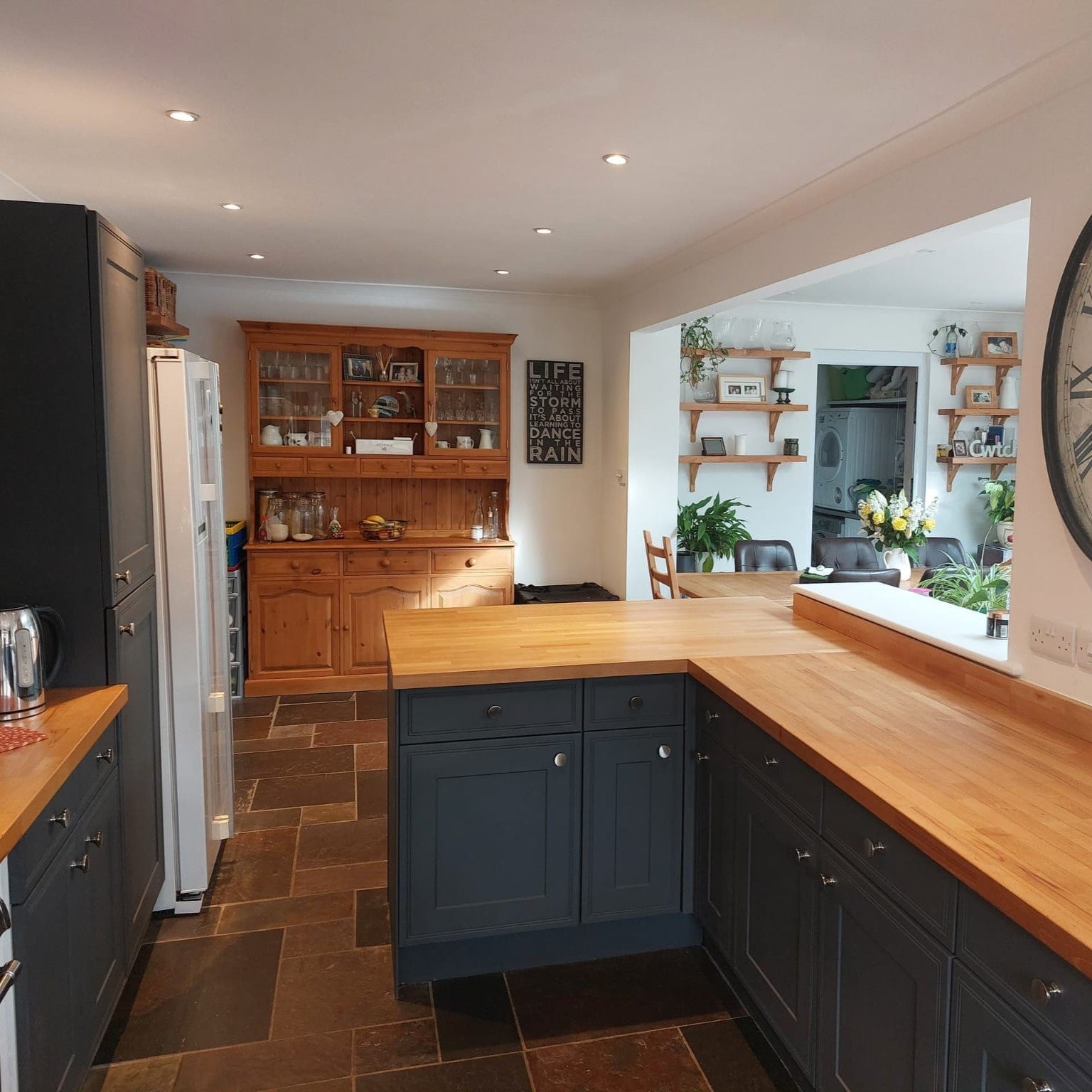
Köket på bilden är målat med den bläckblå After Midnight- tonen.
Hitta franska blå nyanser:
Himmelsblå: Ol' Blue Eyes , från Al Fresco-serien
Denimblå: Hornblower , från Lazy Range-serien
Bensin: Steel Teal , från Al Fresco-serien
Ink blue After Midnight , från Al Fresco-serien
Favoritblå: Forget Me Neve r, från Al Fresco-serien
Pastellblått: Crystal Blue , från Lazy Range-serien
Ankägg blå: Ankunge , från Al Fresco-serien
Turkos: Beach Hut , från Trim Paint-serien och väggfärgsserien
Svart omslag: Smooth Operator , från Trim Paint-setet och väggfärgssetet
Ljust mellanblått: Nötknäppare , från Trim Paint-serien
Elblått: Kiss Me Sloely , från Al Fresco-serien
Scotch Mist , från Lazy Range-serien
Baby Blue: Ja tack! Från Al Fresco-serien
Turkos: Santorini , från Trim Paint-serien och väggfärgsserien
Rökblått: Jitterbug , Trim Paint och från väggfärgssortimentet